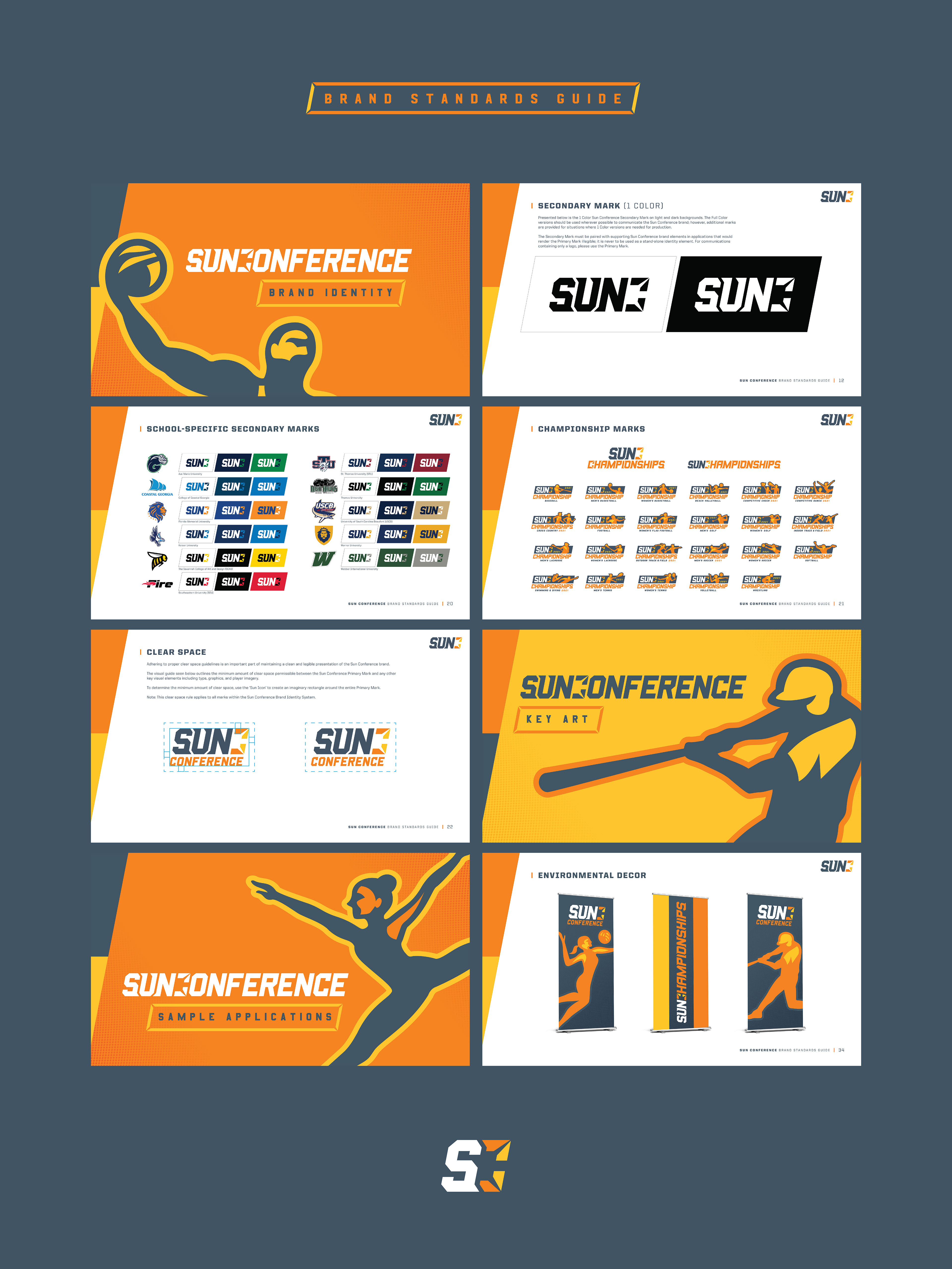
The Sun Conference was looking for a new visual identity to symbolize the rebirth of the brand, with a strategic objective of positioning themselves as the leading NAIA Conference in the country.
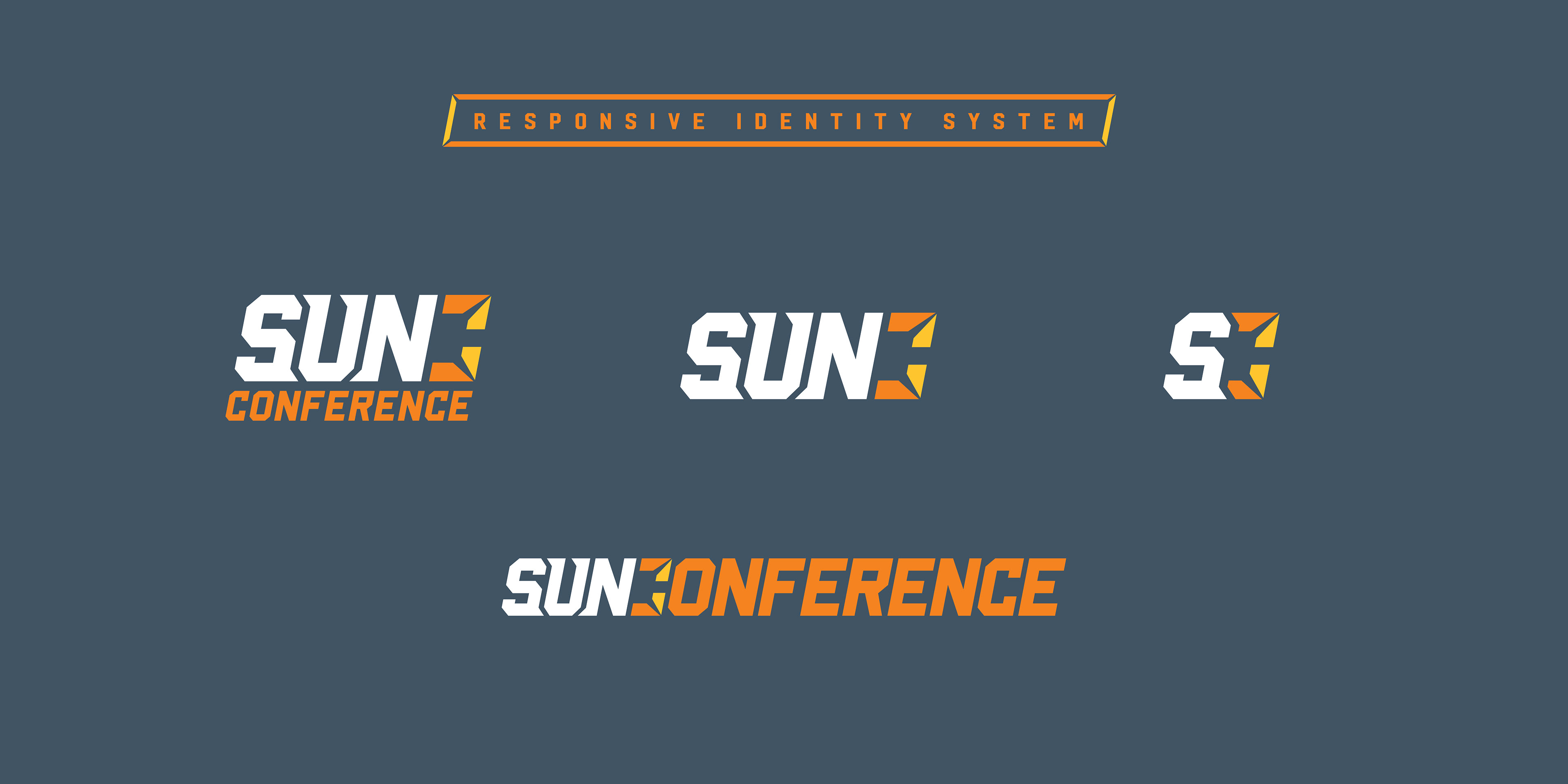
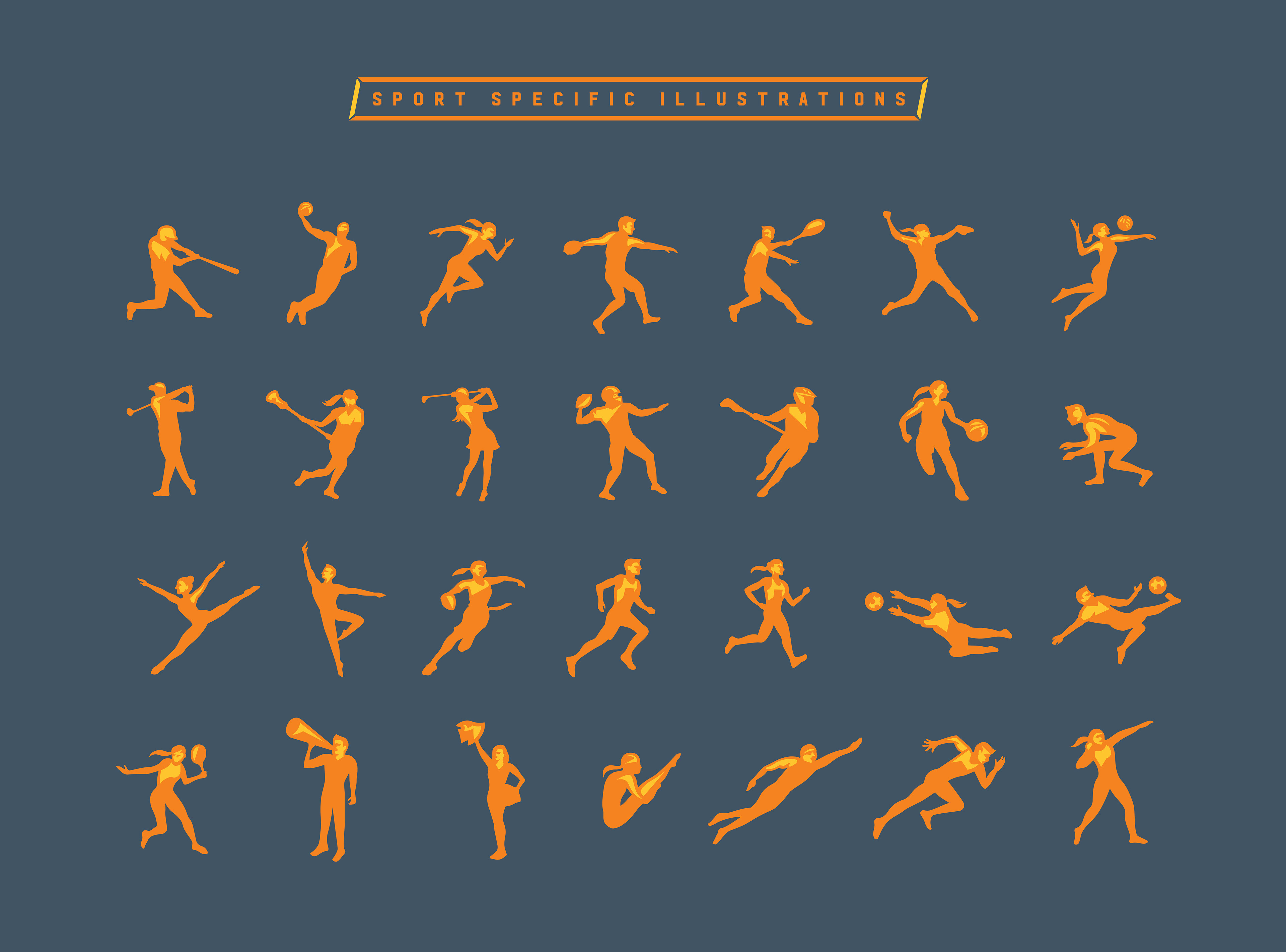
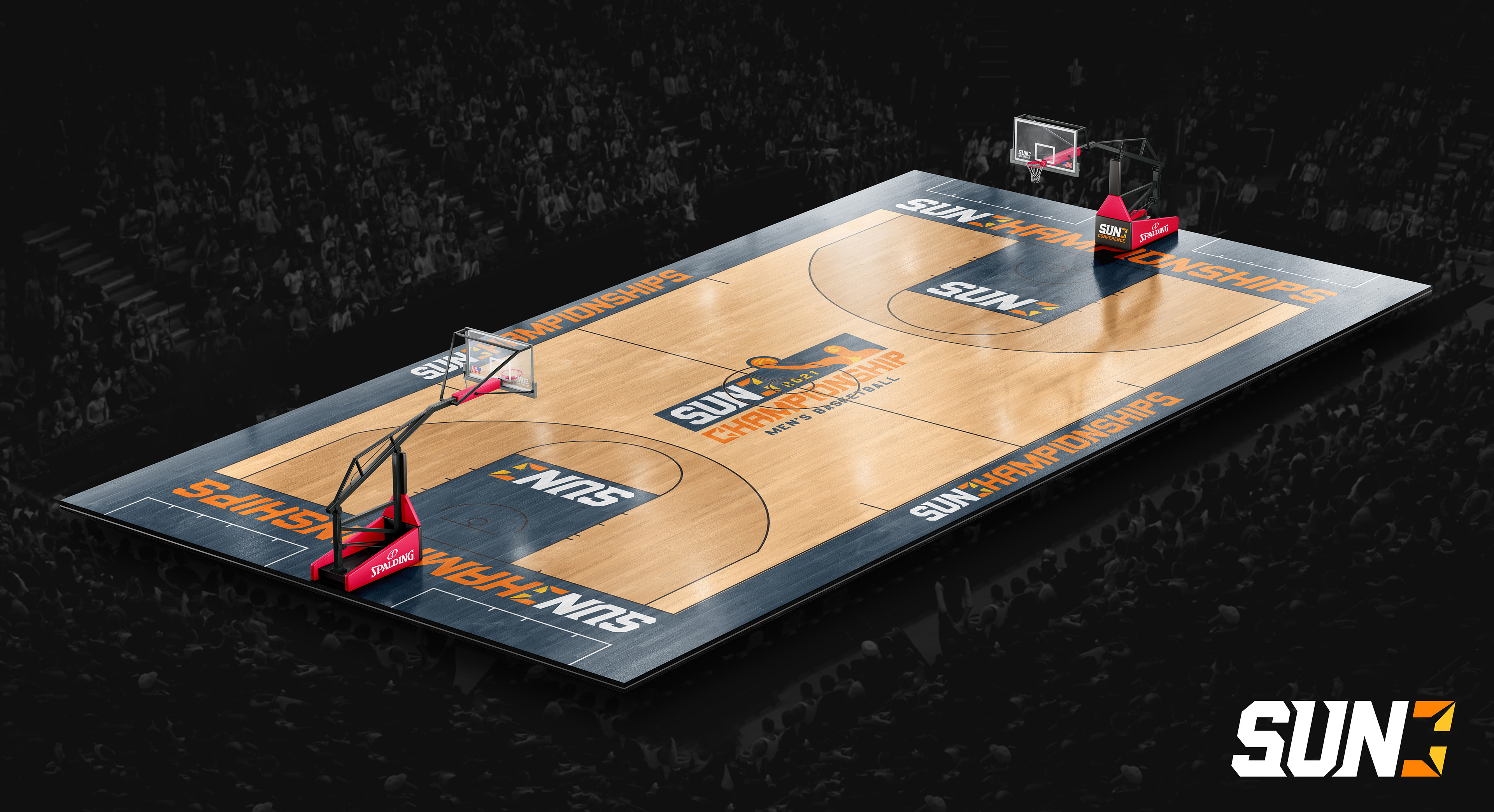
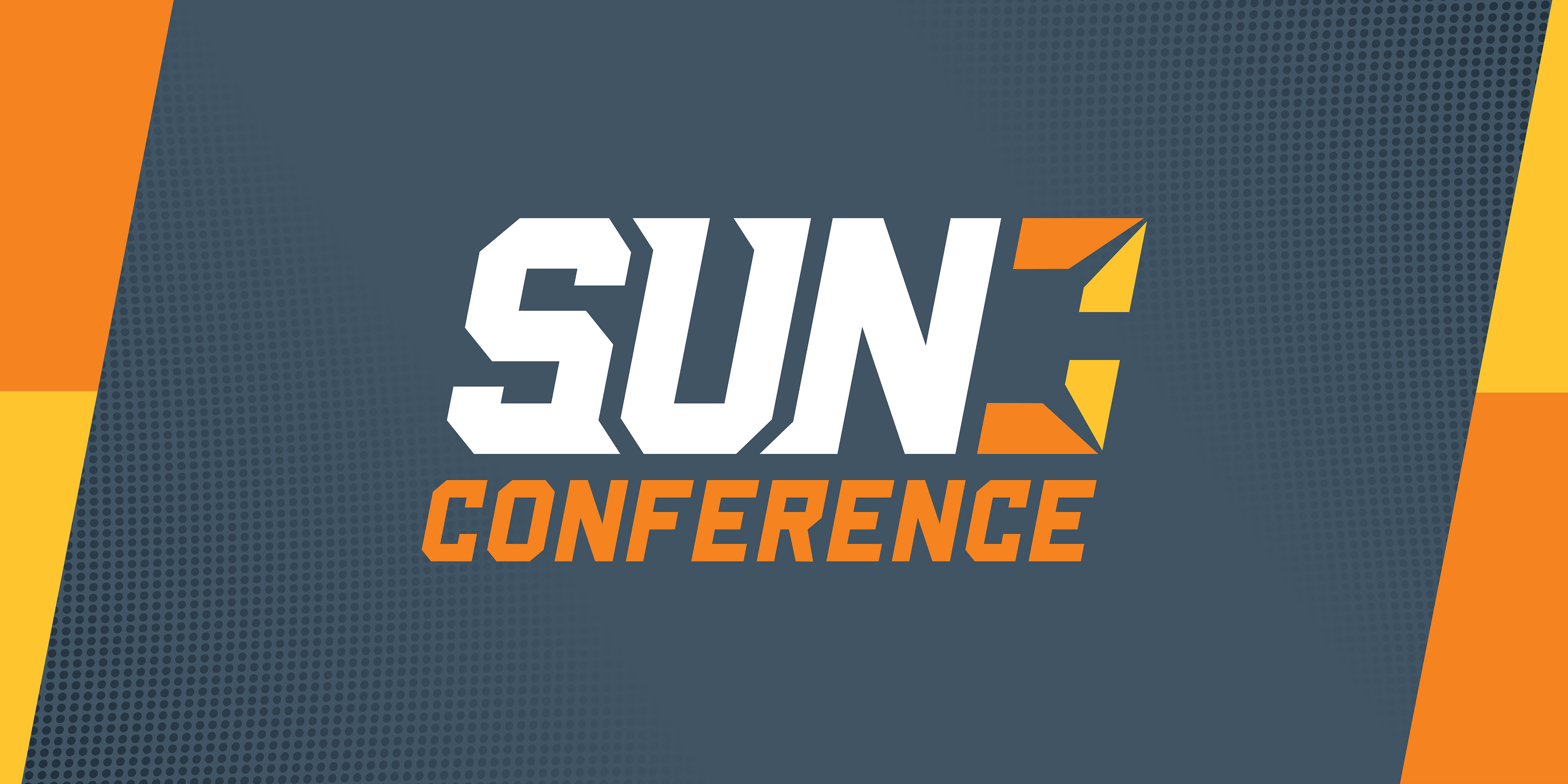
Leadership noted that the new brand should exude excellence and a sense of confidence. A bold, angular typeface was used to convey strength and power, along with the literal idea of moving forward. An element of regionality was included in the sun rays that create the 'C'. These rays also symbolize unity and the idea that the conference is made up of a diverse group of equal parts. And while the golden, orange tones were a must...the new mark, pairs them with a unique slate color which grounds the mark and serves as a point of difference as a truly unique color in the landscape of college athletics. All of these elements unite to form a very clean brand mark that easily adapts to each individual institution's color palette.
Work done in collaboration with Enliven
------------
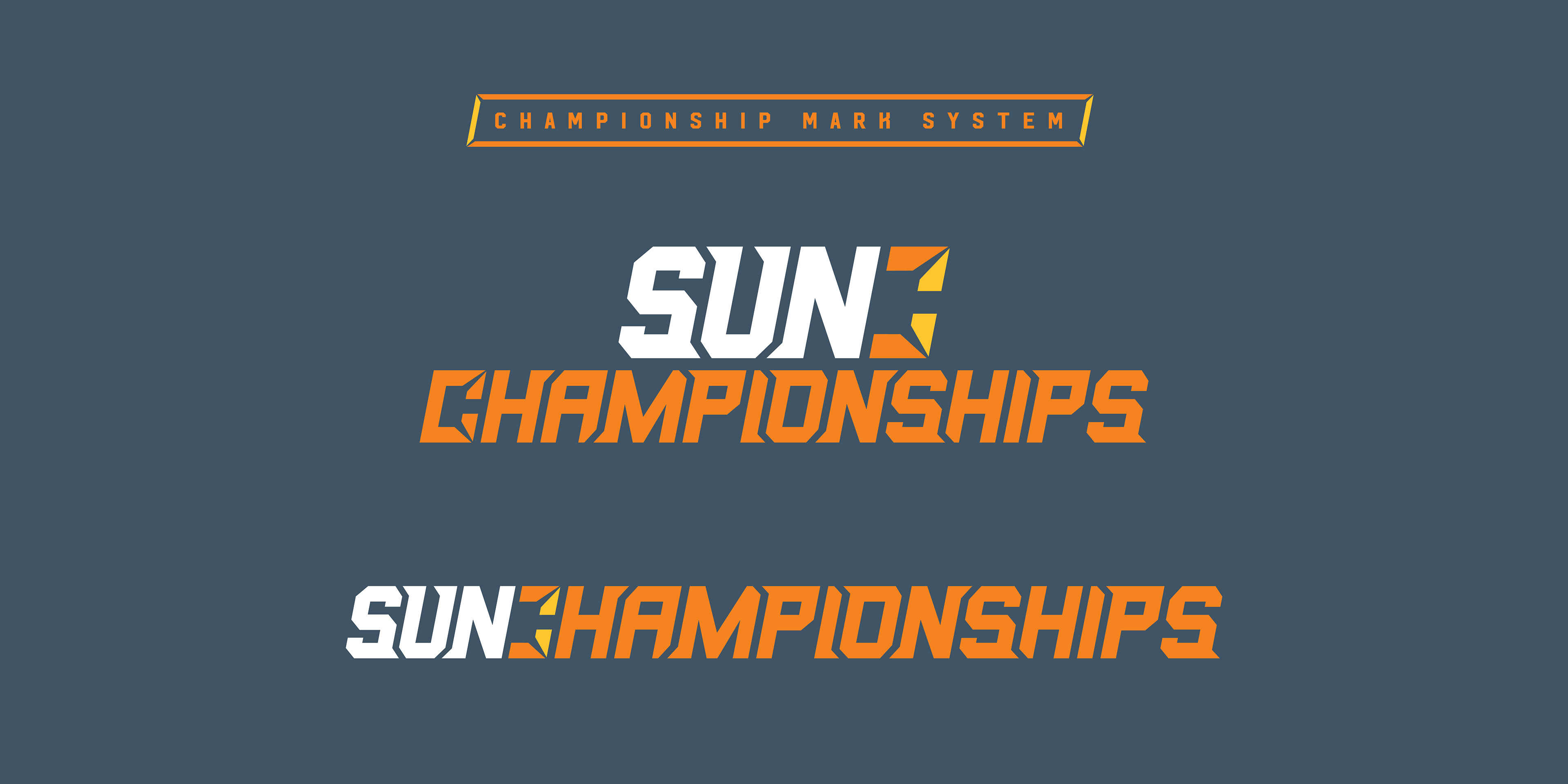
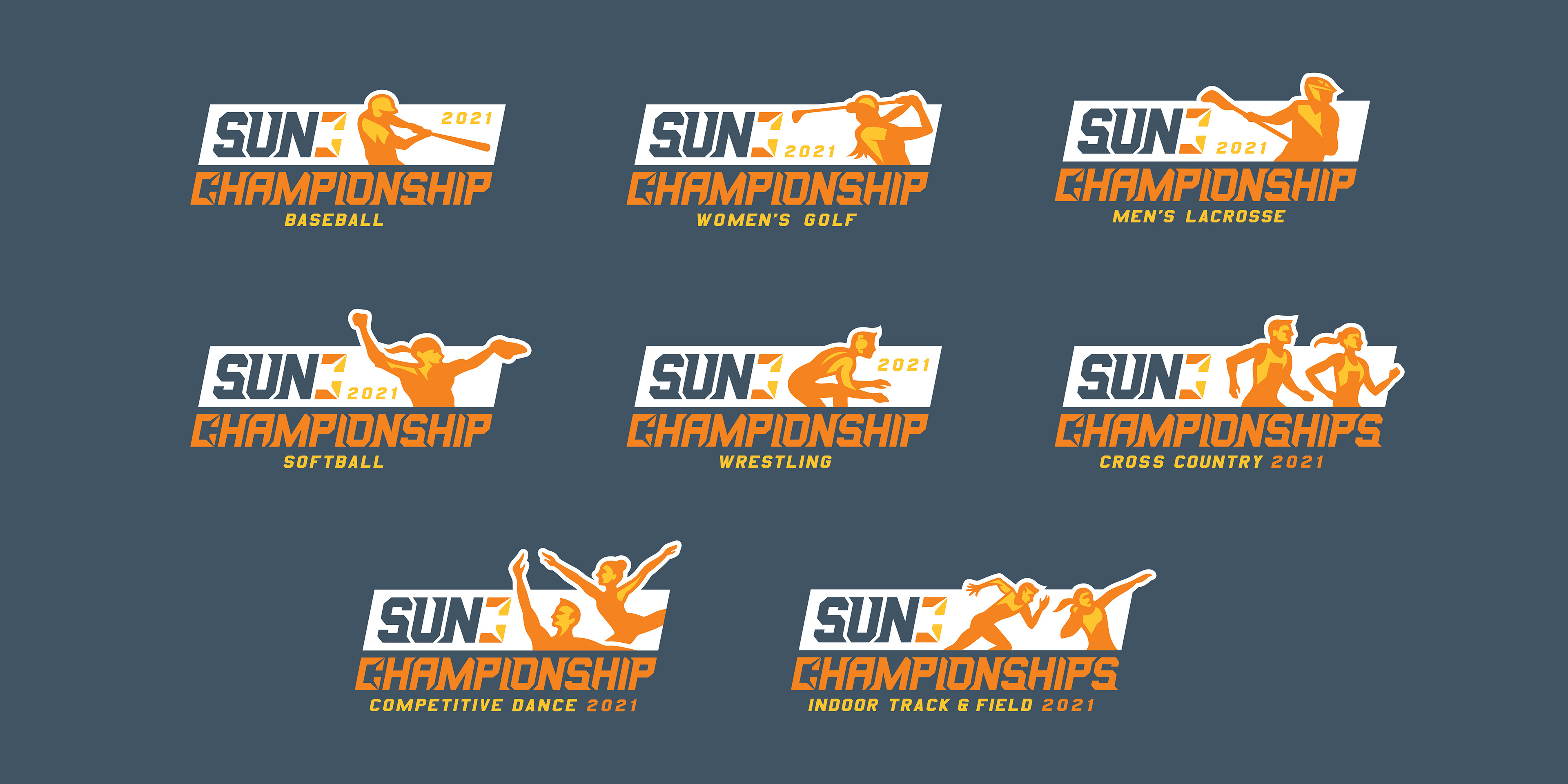
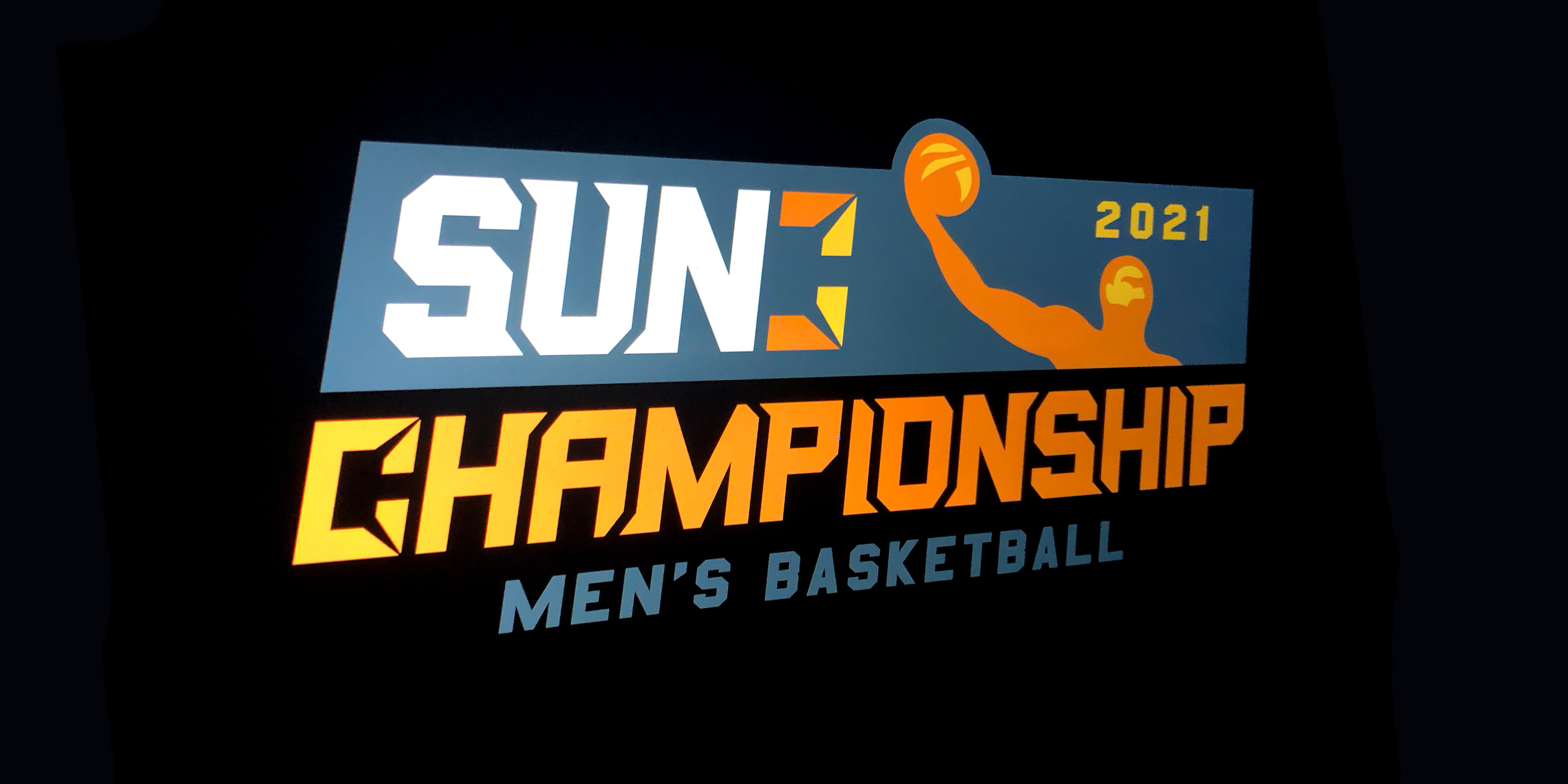
Brand Identity, Brand Standards Guide, Championship Mark System