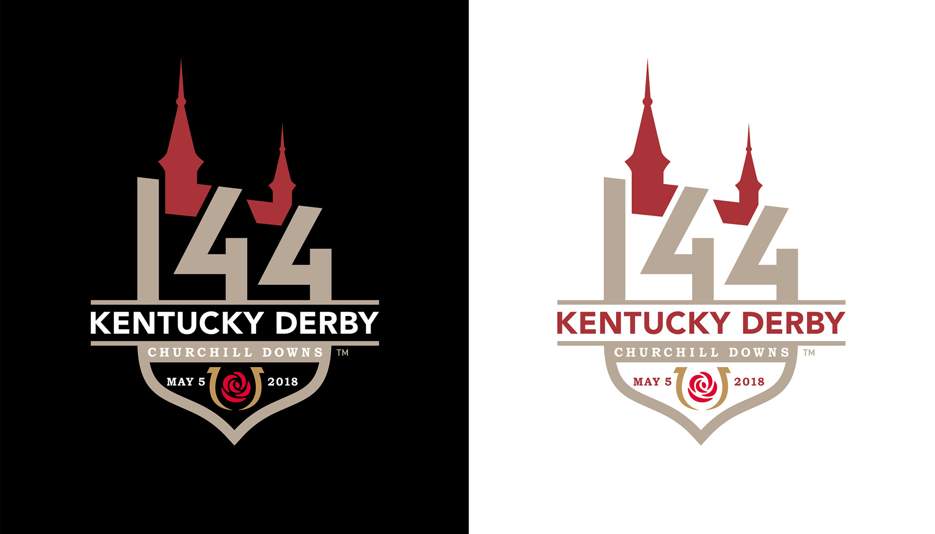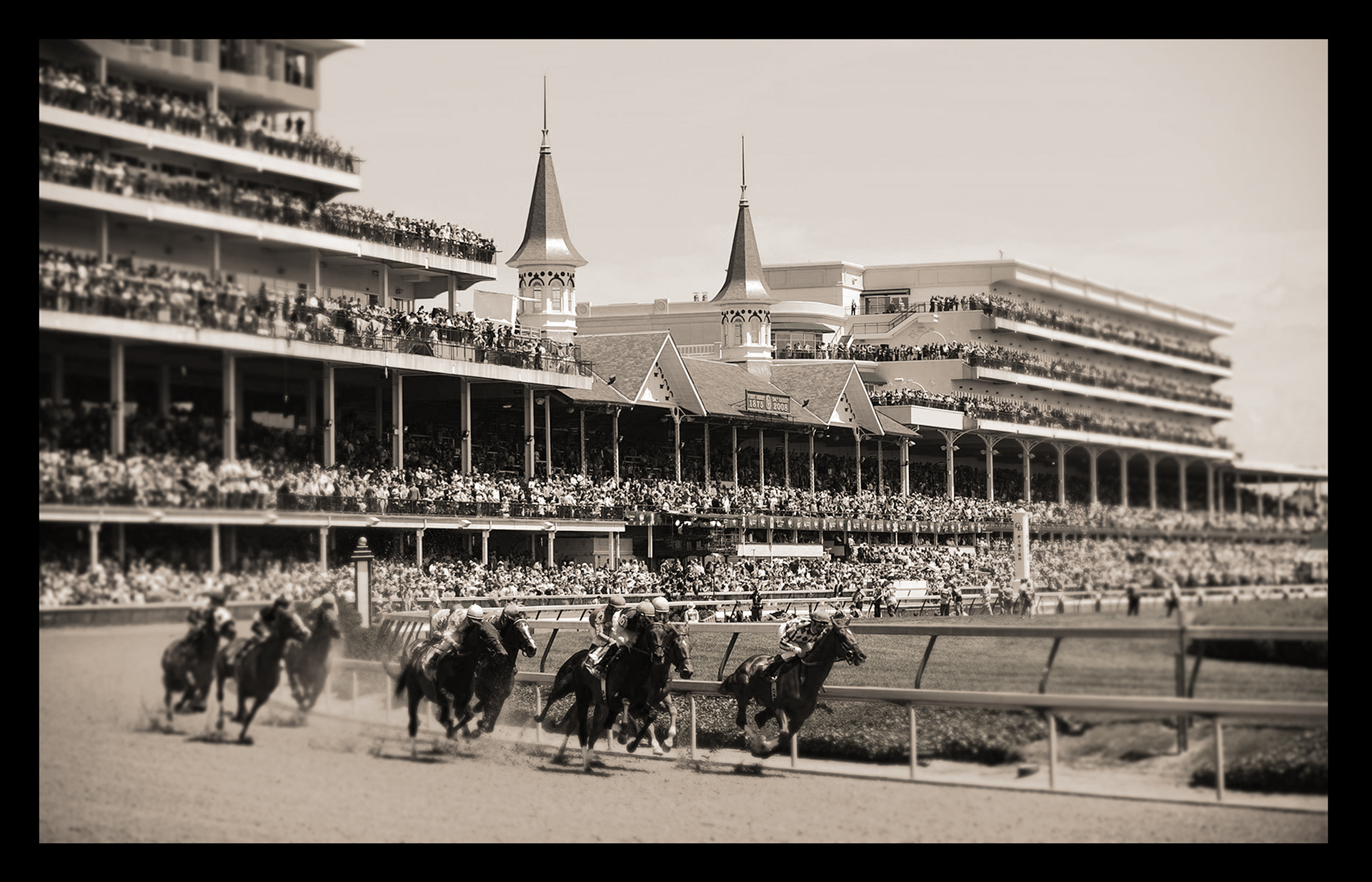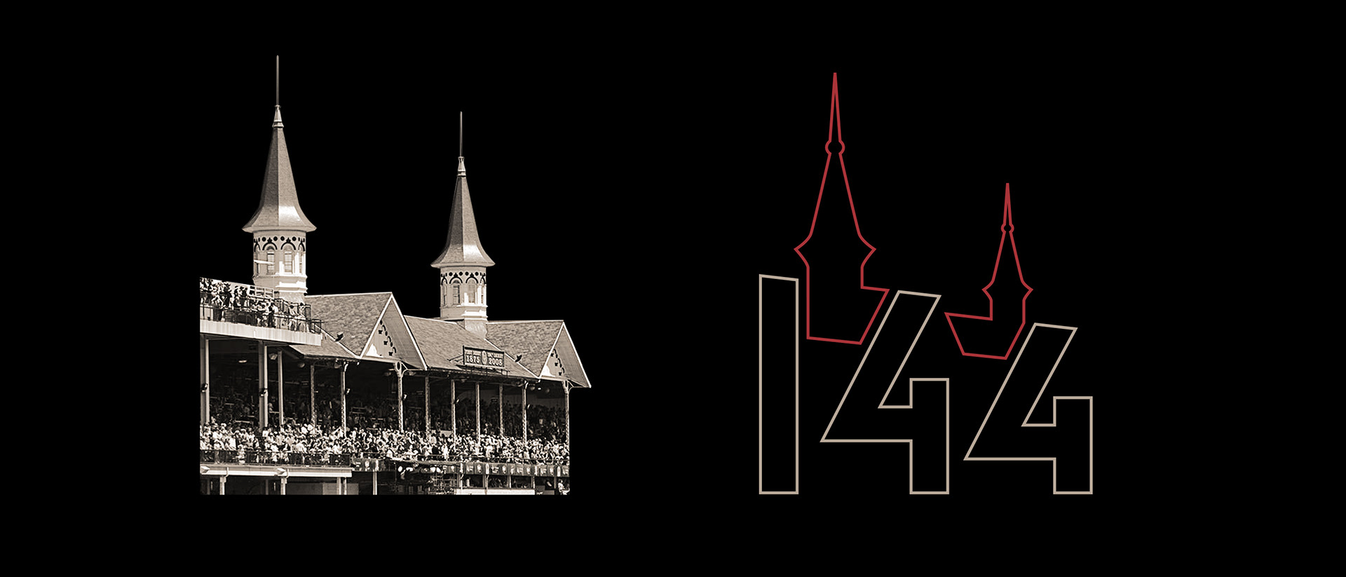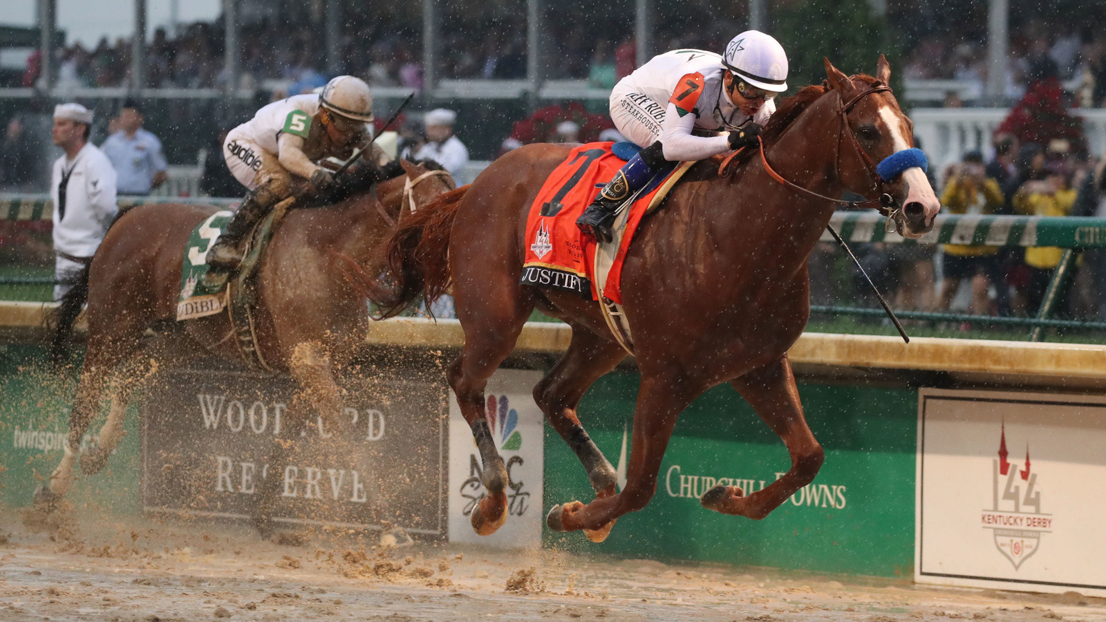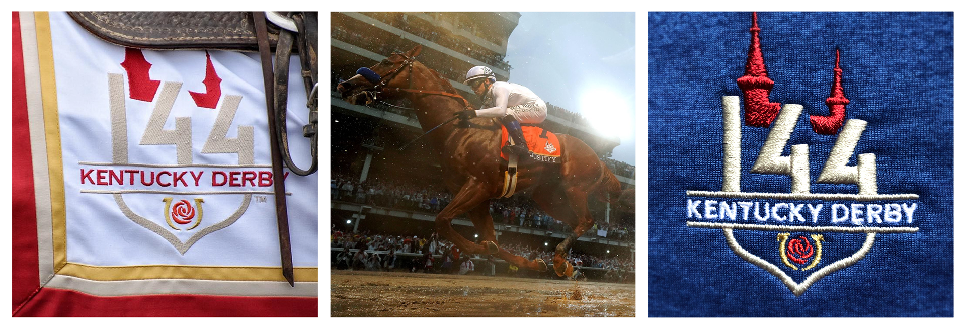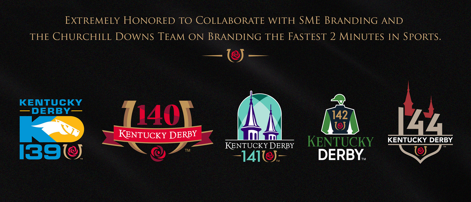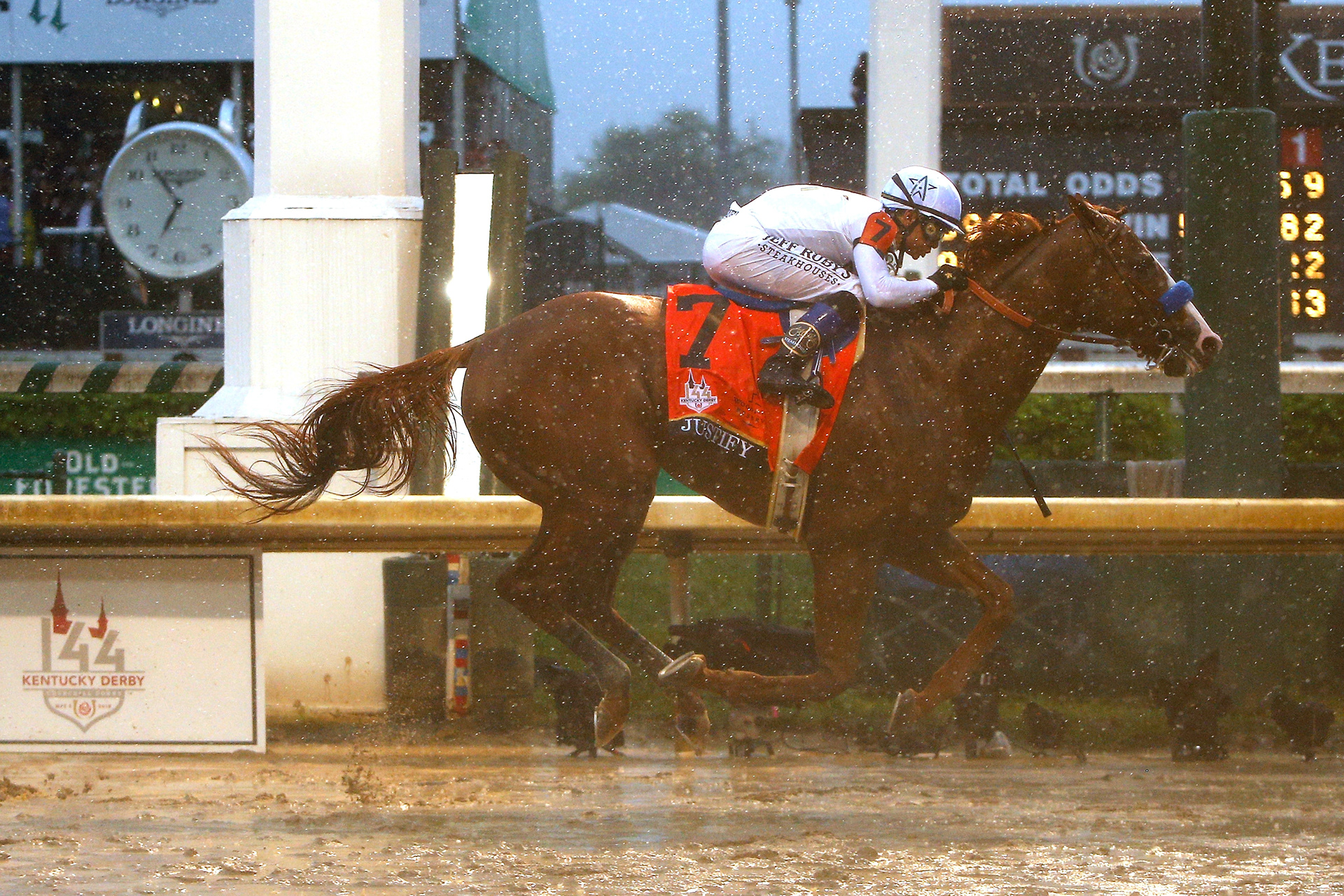

Historic Churchill Downs was the focal point of the 144th Kentucky Derby event brand. A typographic badge was developed with the 144 forming the architectural grandstands that overlook the track. The iconic Twin Spires rest proudly in between. One of the challenges set forth in the brief was to create a unique sense of place that celebrated the grandeur of the event. The result was quite successful, particularly in licensing where the badge proved to be easily adaptable across a wide variety of merchandise applications. This was partly because the identity was built with the flexibility to integrate the date and location (where applicable).
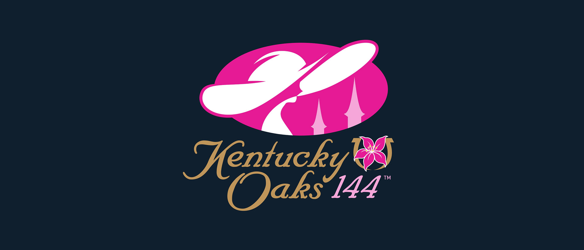
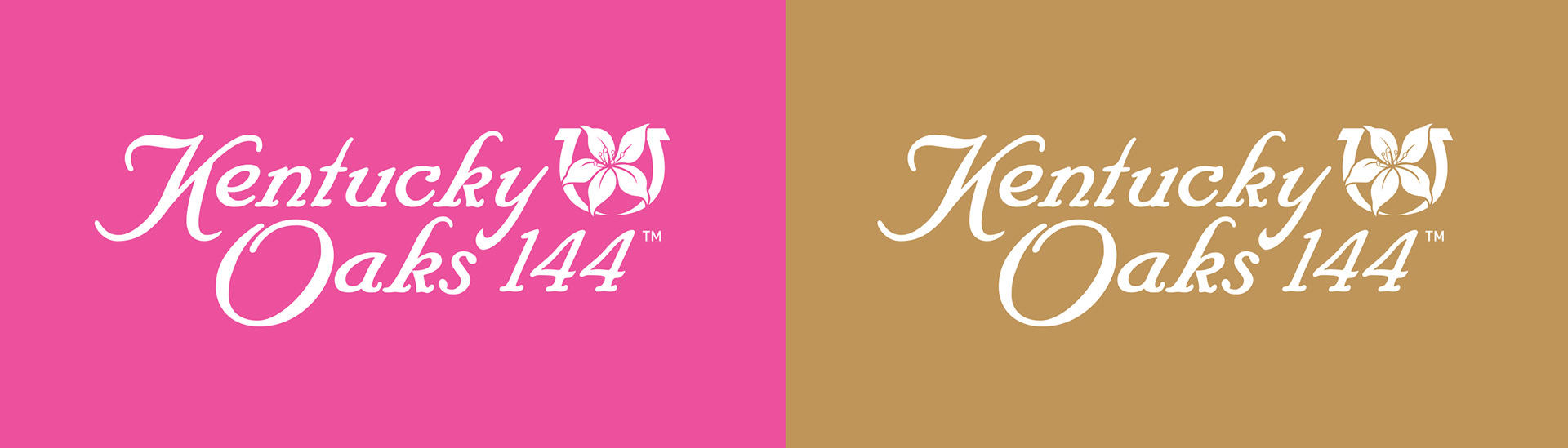
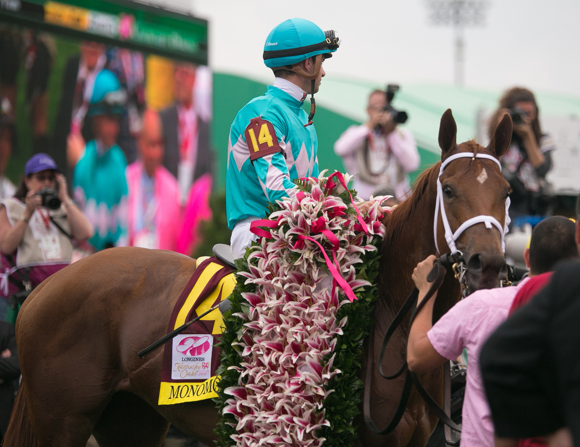
2018 also brought with it a new Kentucky Oaks identity (the sister race to the Derby). Also known as 'Ladies Day' at Churchill Downs, this year's Oaks mark was the first major graphical change since the 140th running in 2014. True to the brand, the mark is vibrantly pink. It features a fashion forward visual direction, depicting a woman in a larger than life Derby hat overlooking the scene at Churchill Downs. Both marks were prominently featured throughout the venue, providing a visual identity to another historic moment in time.
----------
Creative Director: Edward M. O'Hara
Brand Identity, Brand Standards Guide