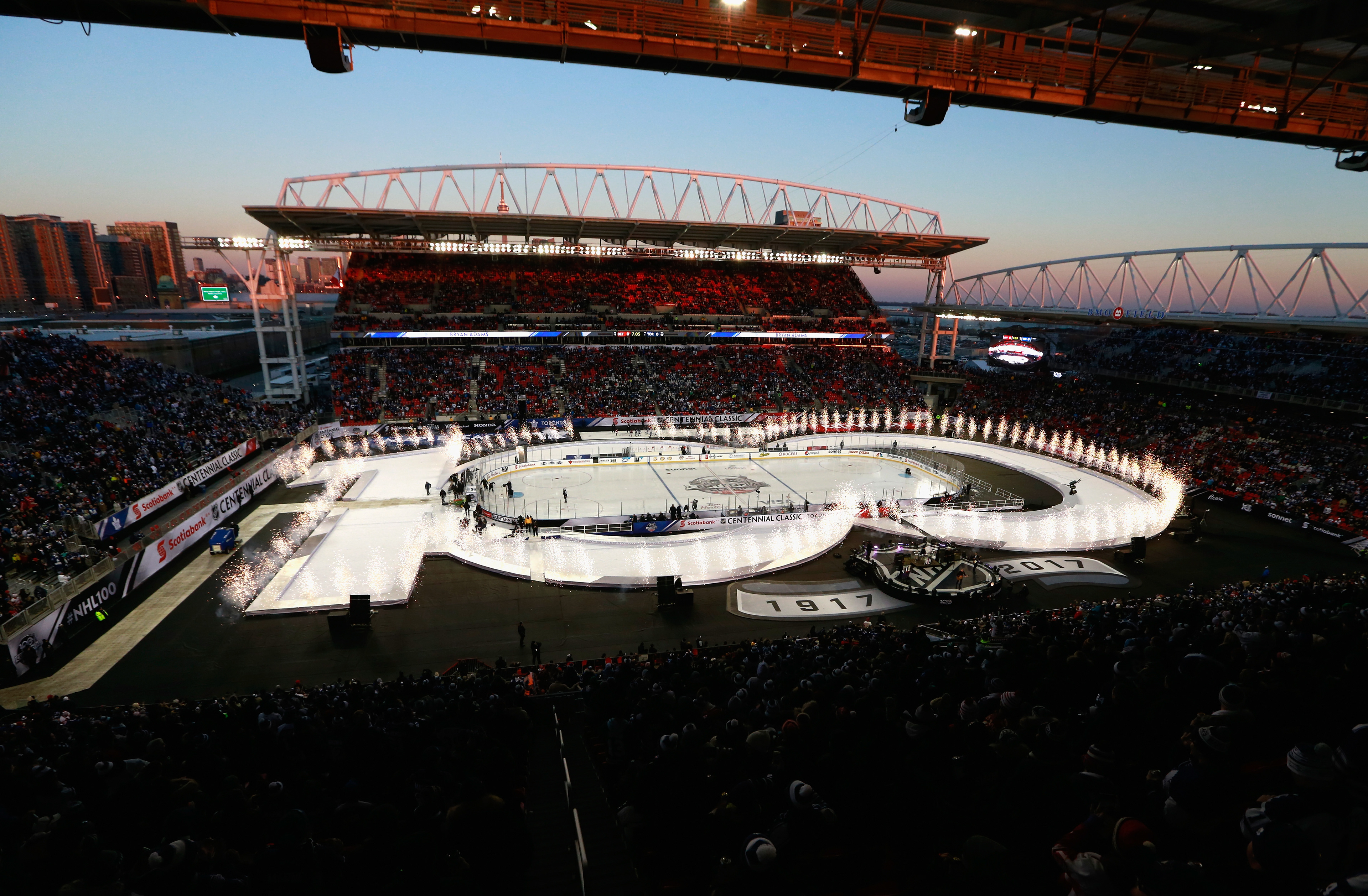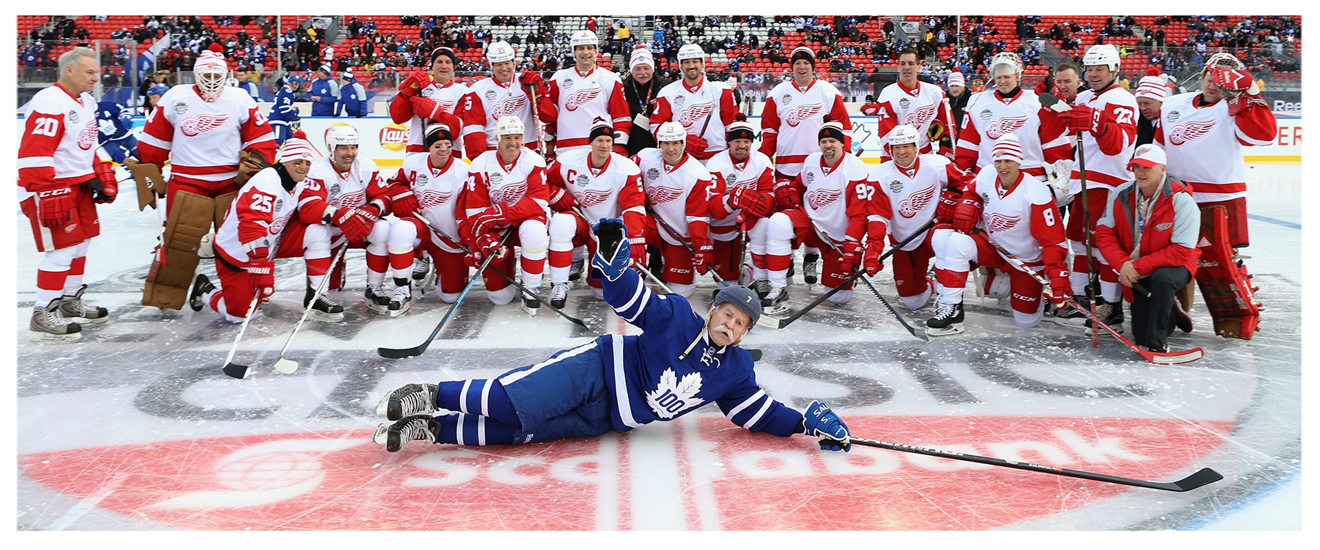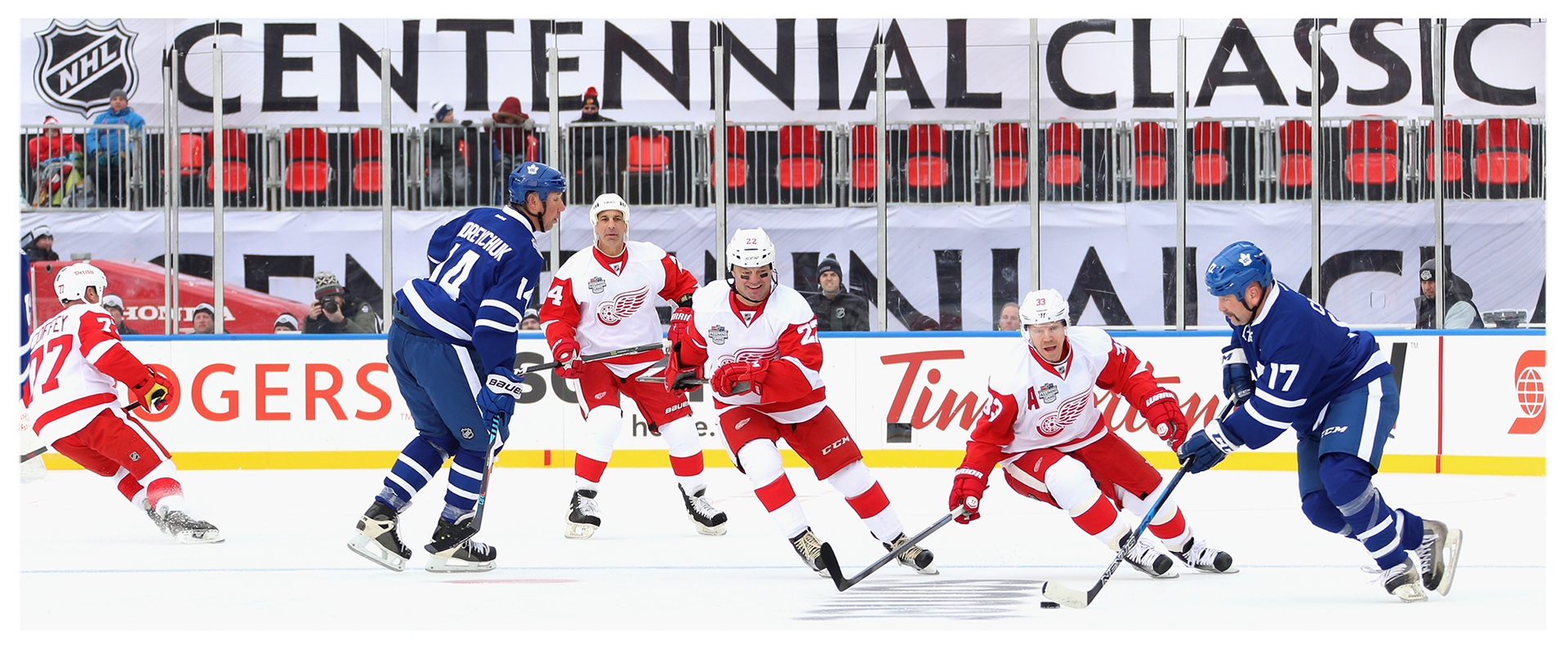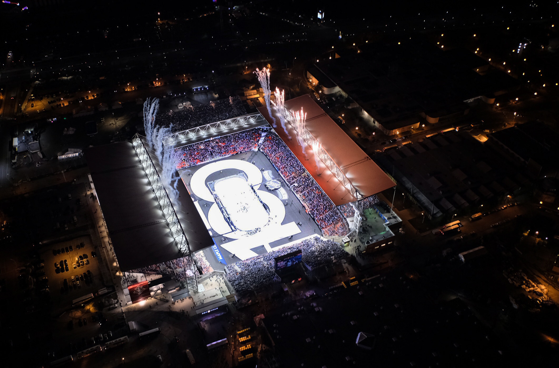


The first ever NHL Centennial Classic presented a once-in-a-lifetime opportunity to captivate fans and build momentum leading into the celebration of a monumental anniversary for the Toronto Maple Leafs and the entire National Hockey League. Canadian and American viewers alike were brought together in this celebration of 100 years of hockey history. In a game that is continually growing, the NHL Centennial Classic was unlike any outdoor game to date.
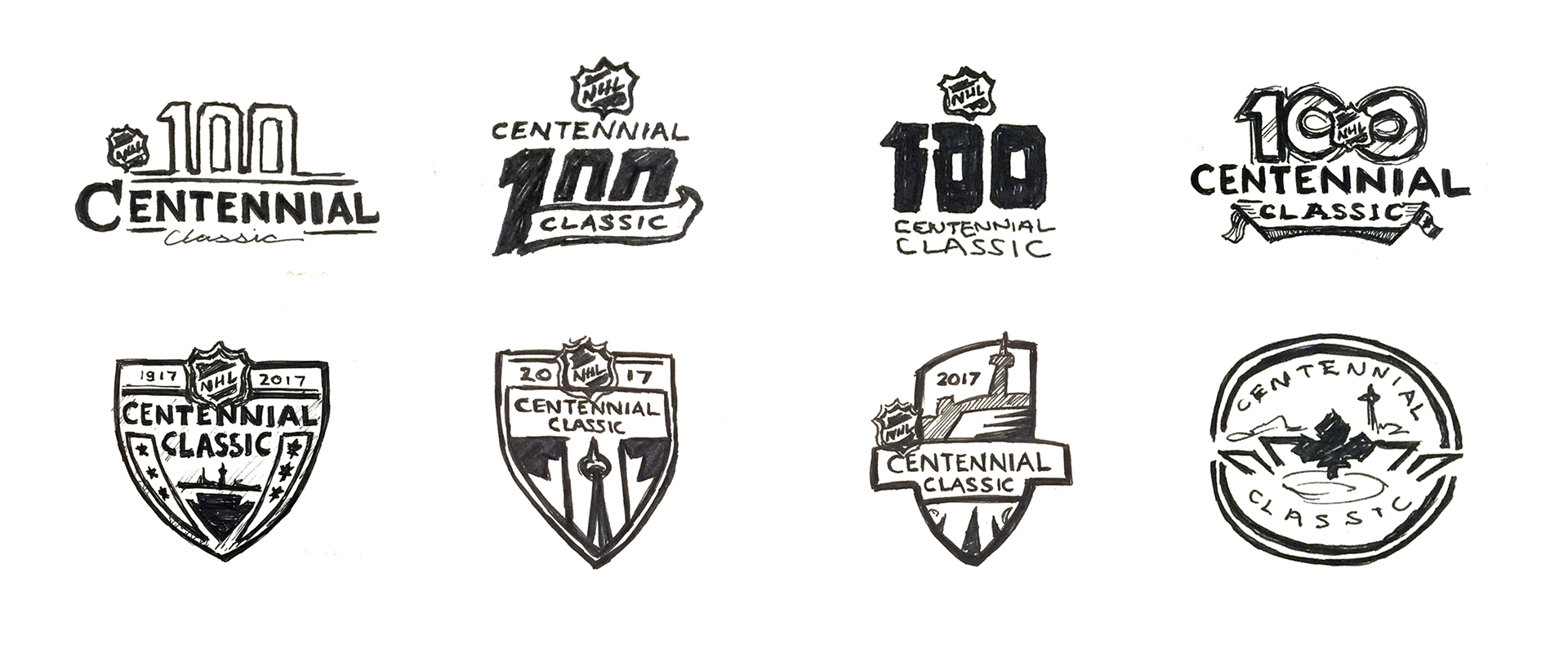
To properly represent this iconic moment in time, the challenge was to create a brand identity that reflected the grandeur and uniqueness of the event, while also being representative of a timeless game that has seen 100 years of rich sacred traditions, rituals, passion and togetherness. The event identity had to celebrate the past but also engage and inspire fans of both clubs and the league as a whole for generations to come.
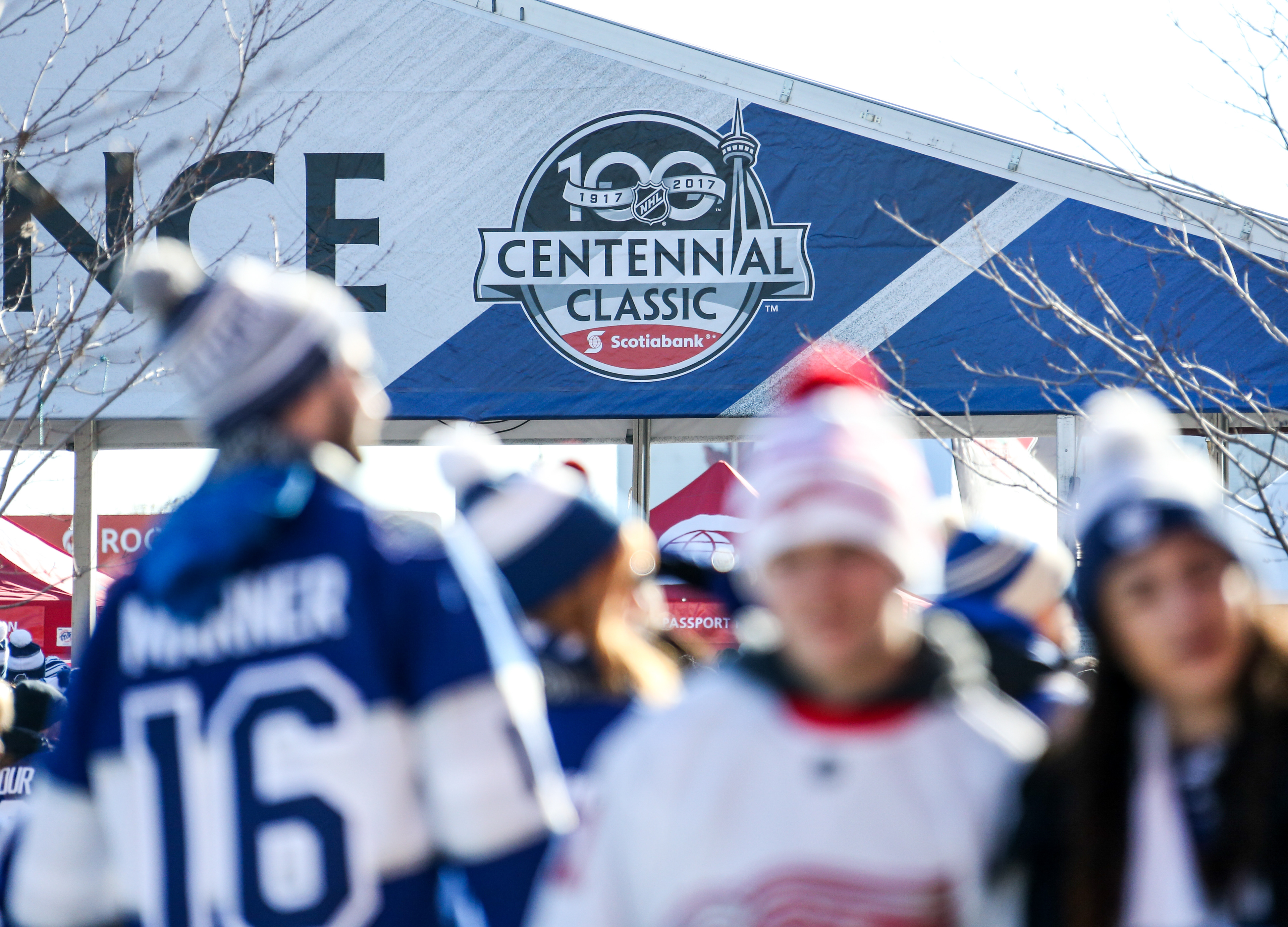
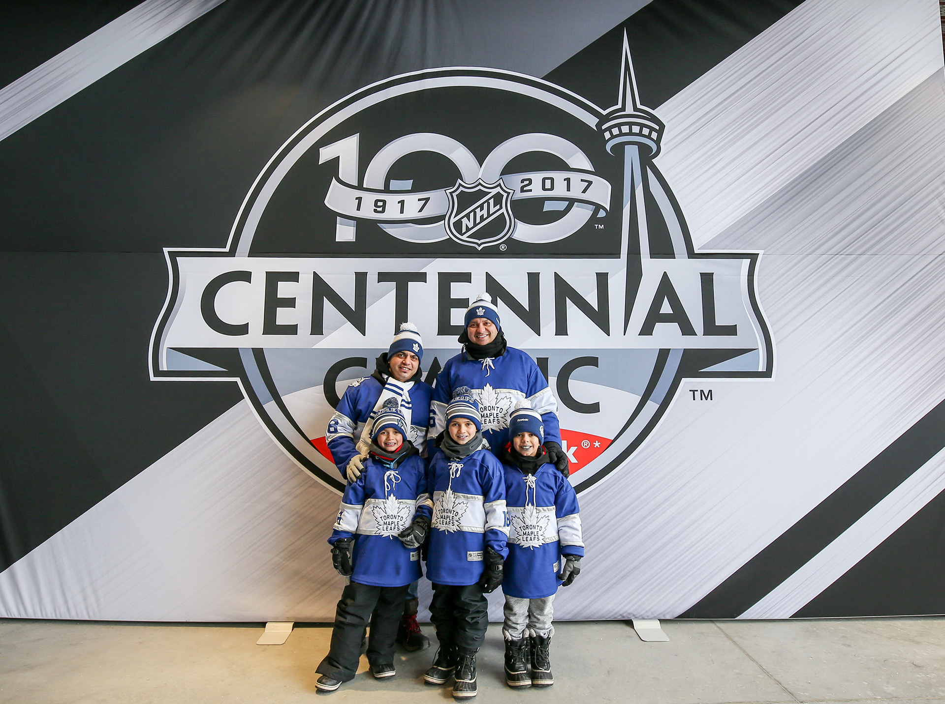
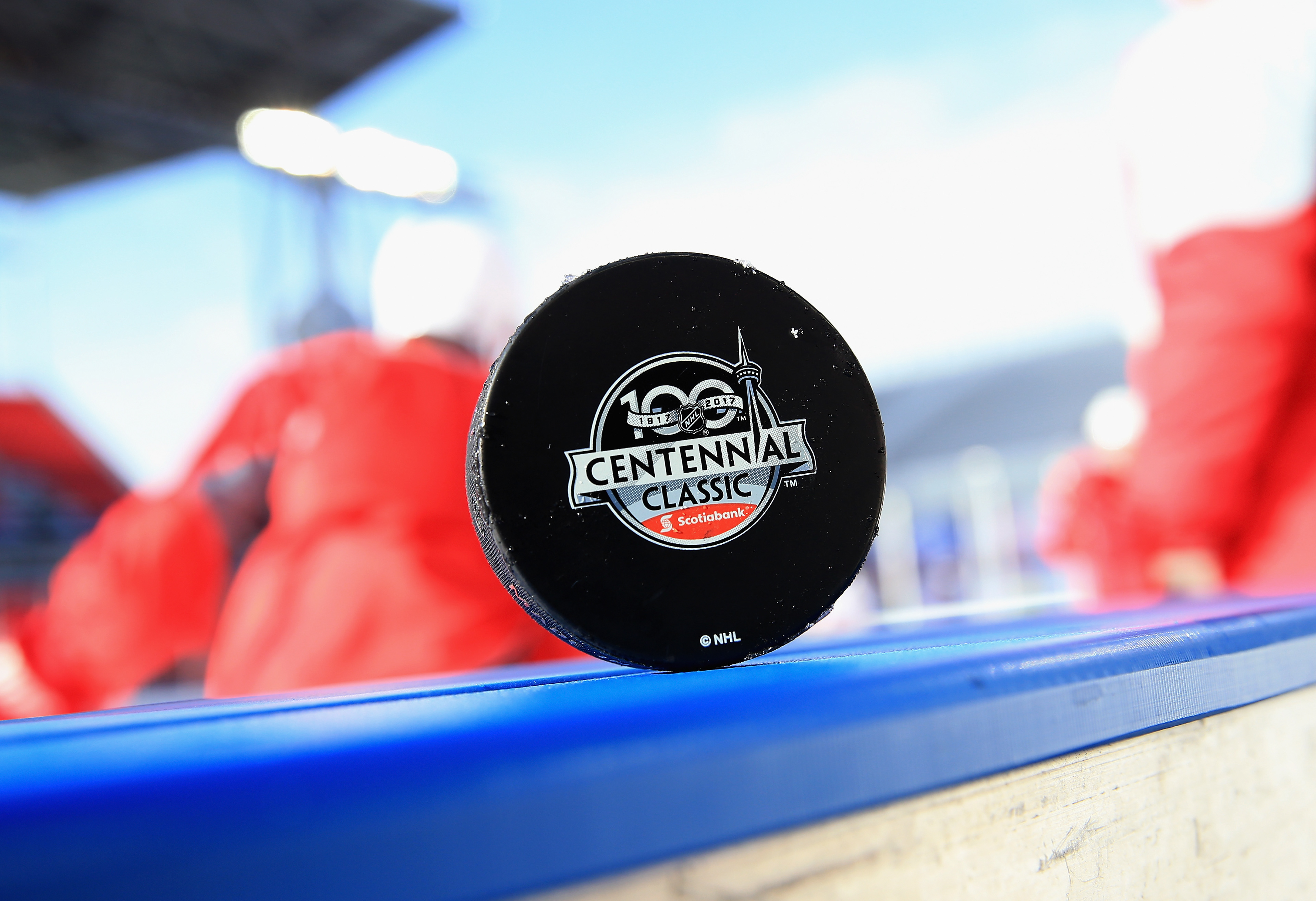
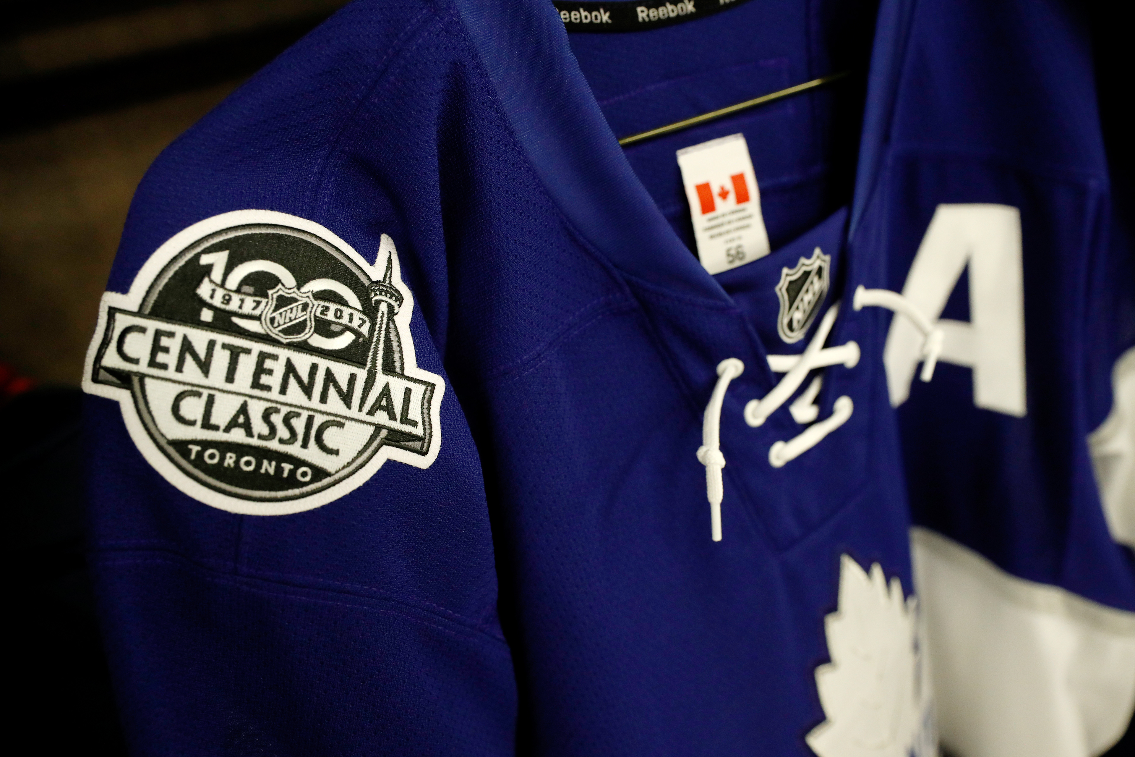
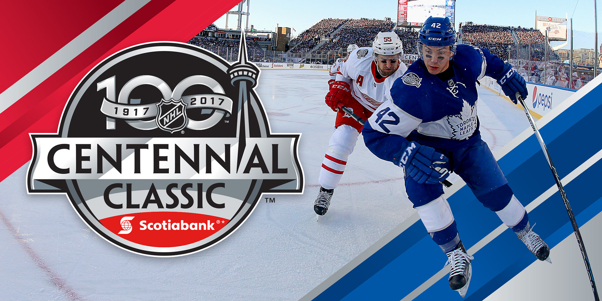
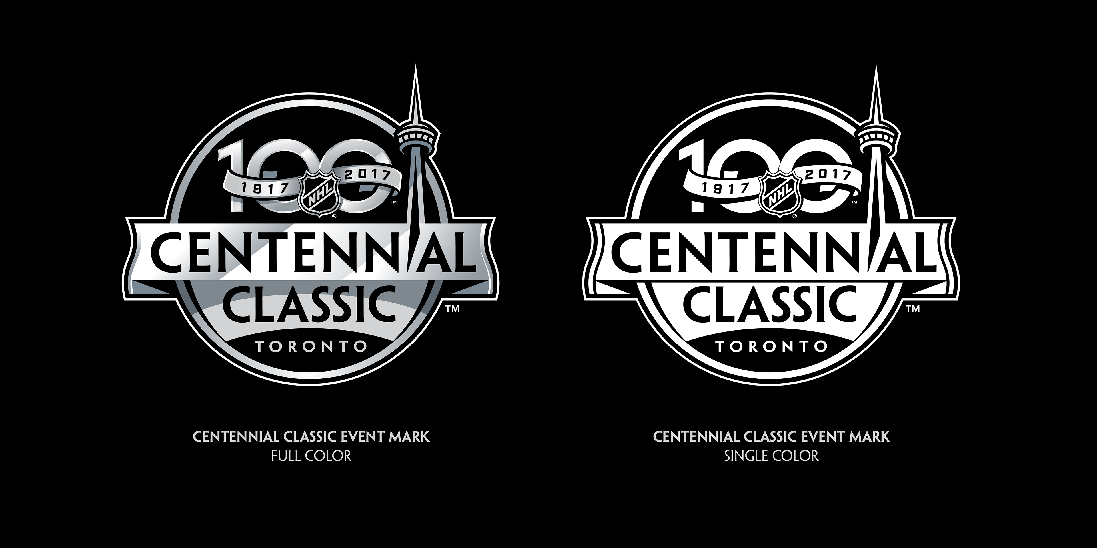
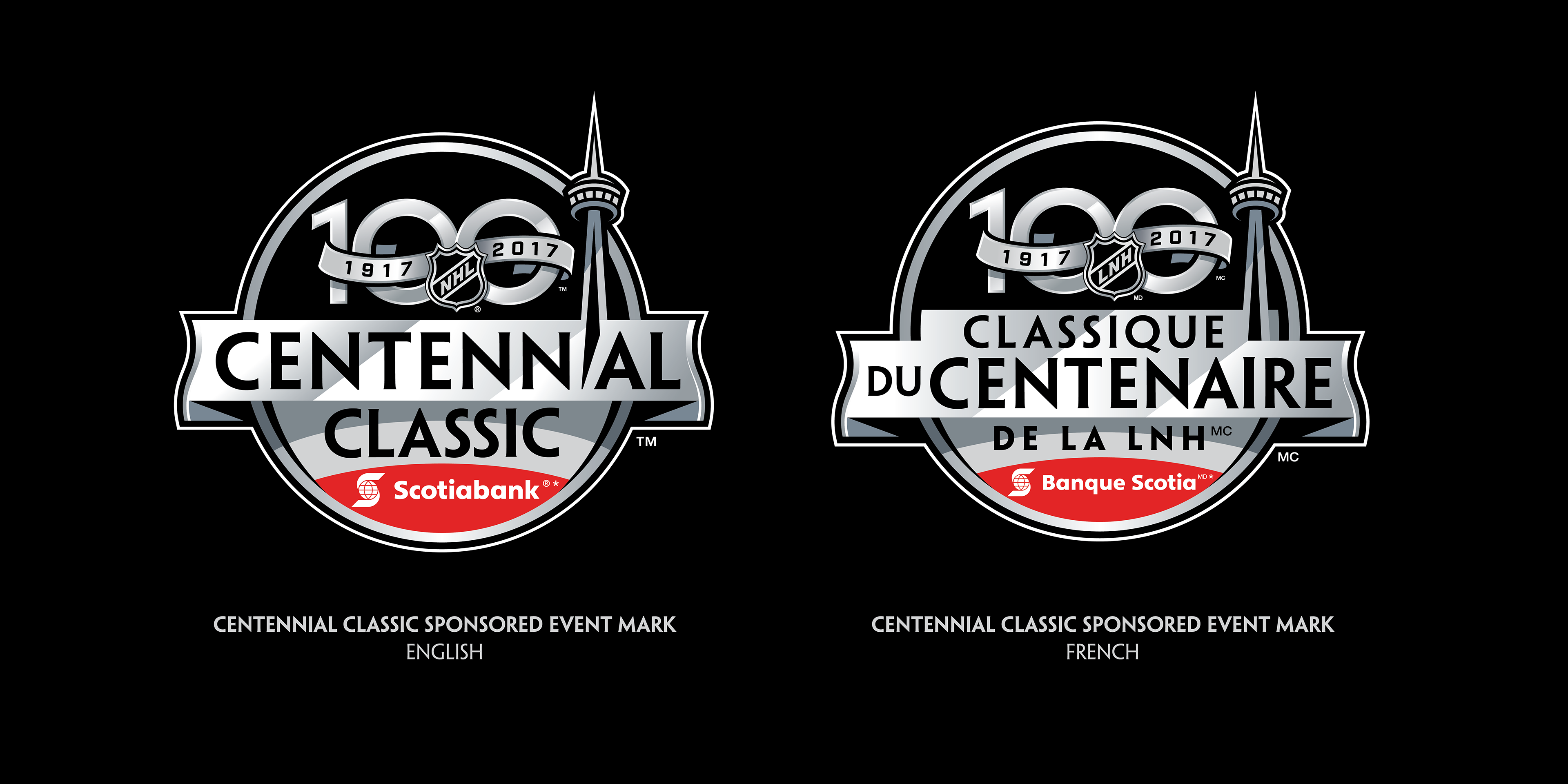
The resulting event mark and look tools kit pays homage to both the NHL parent brand as well as the participating clubs. It is rooted in the league's primary black and silver palette with accents of Detroit red and Toronto blue. The angular shading throughout is symbolic of a game that is always on the rise, mimicking the upward trajectory within the primary NHL shield.
----------
A special thanks to the entire NHL Events Staff, NHL Creative Services Department, and all of our valued Partners and Vendors for making the 2017 Scotiabank NHL Centennial Classic a huge success.
Brian Jennings, Executive Vice President, Marketing and Chief Branding Officer
Paul Conway, NHL VP of Creative Services
Greg Mueller, NHL Design Director
Infinite Scale, Event Decor
----------
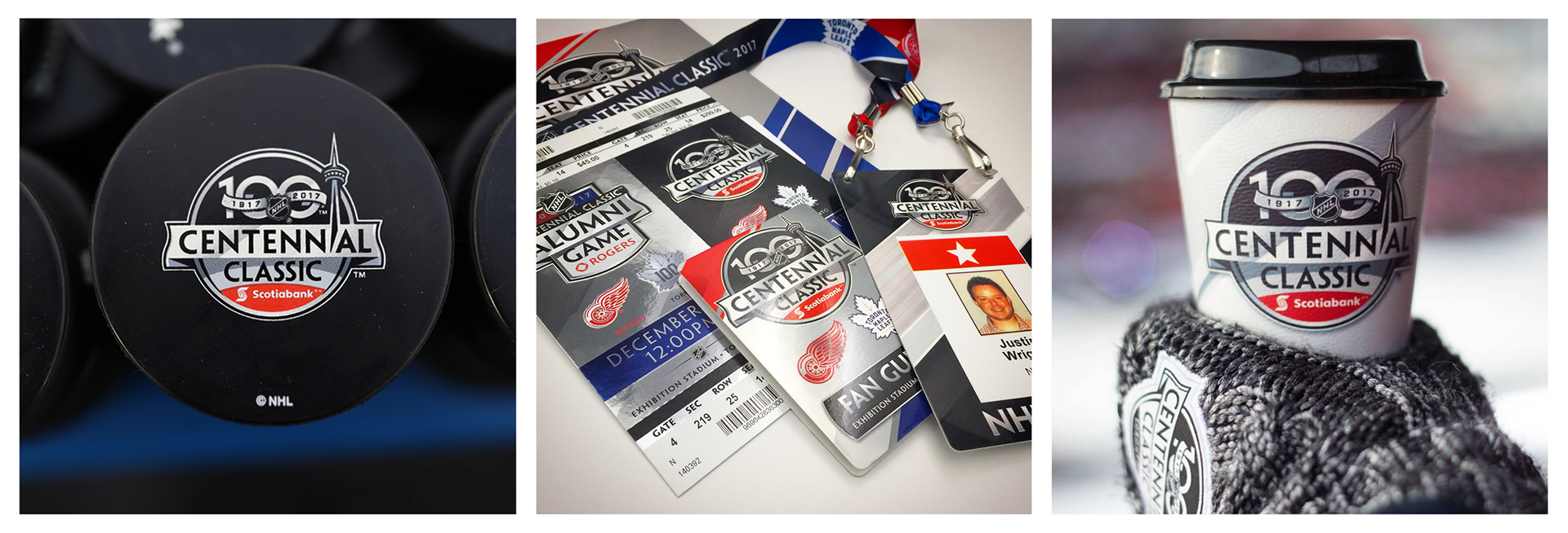
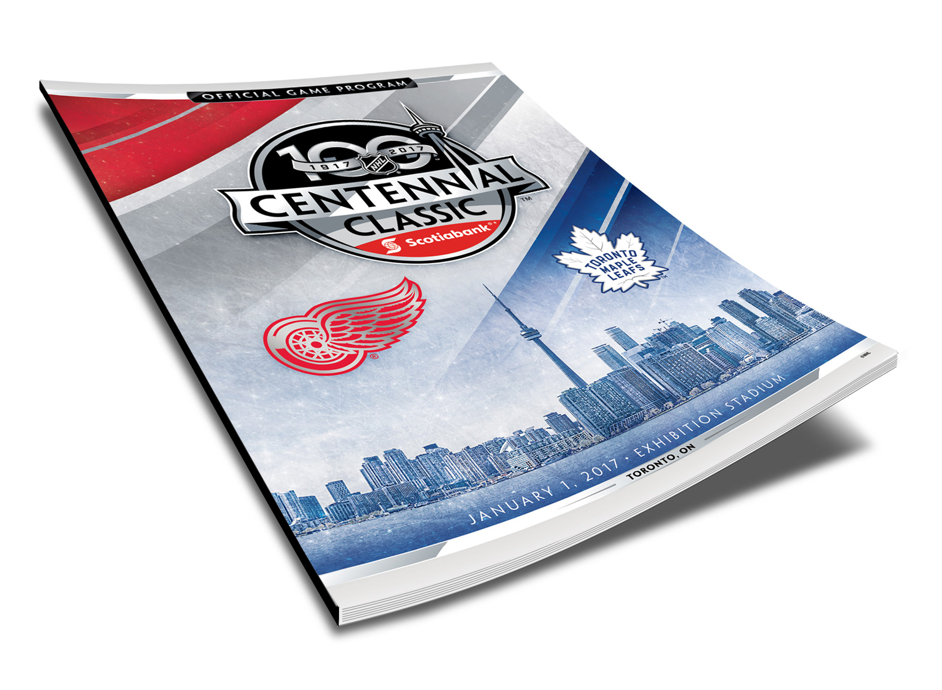
Brand Identity, Look Tools Kit, Brand Standards Guide, Collateral, Environmental


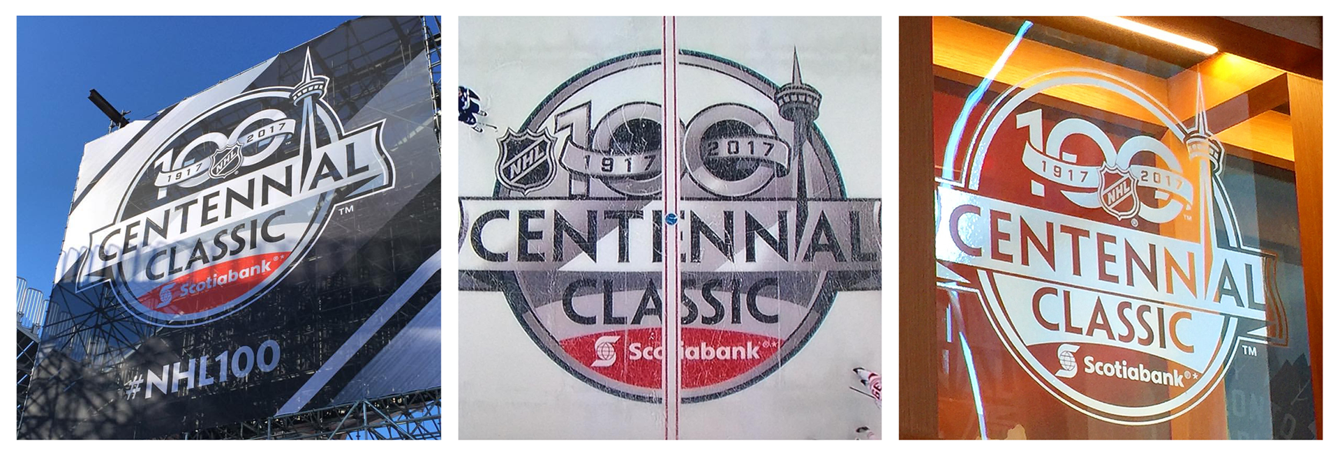
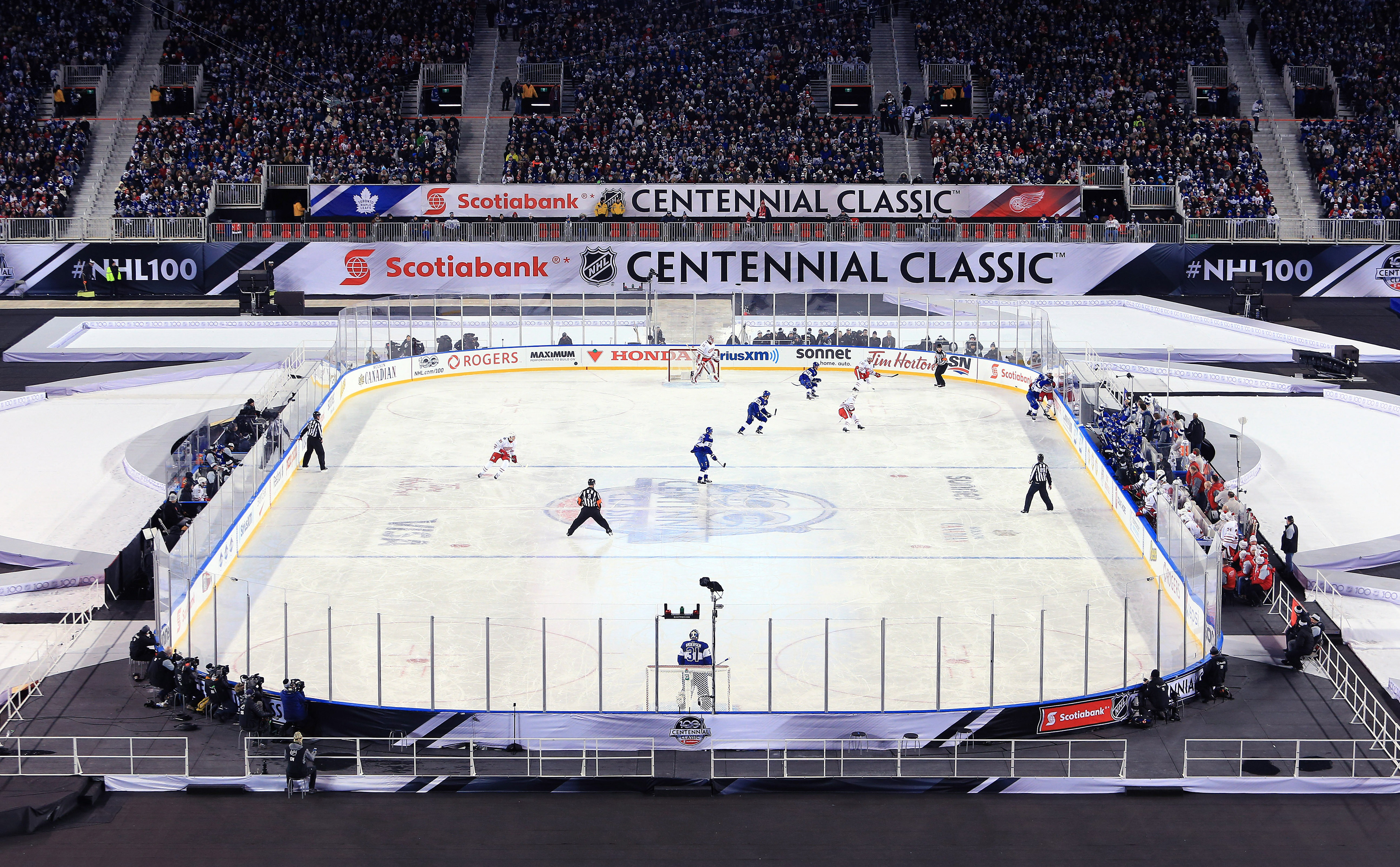
One of the unique challenges for this identity is the center-ice application. The design has to be adjusted slightly to account for the red line that runs right down the center of the mark. In this one unique instance, the NHL shield was shifted to the left of the composition allowing it to appear, unobstructed.
Color presents another interesting challenge in the great outdoors. When in direct contact with the sun, the color black actually melts the ice. Because of this, the darkest darks of the identity are lightened from a pure black to a deep charcoal. In an attempt to make the composition even lighter, silver was used in this application to fill the top half of the mark, creating a more outdoor compatible center-ice hit.
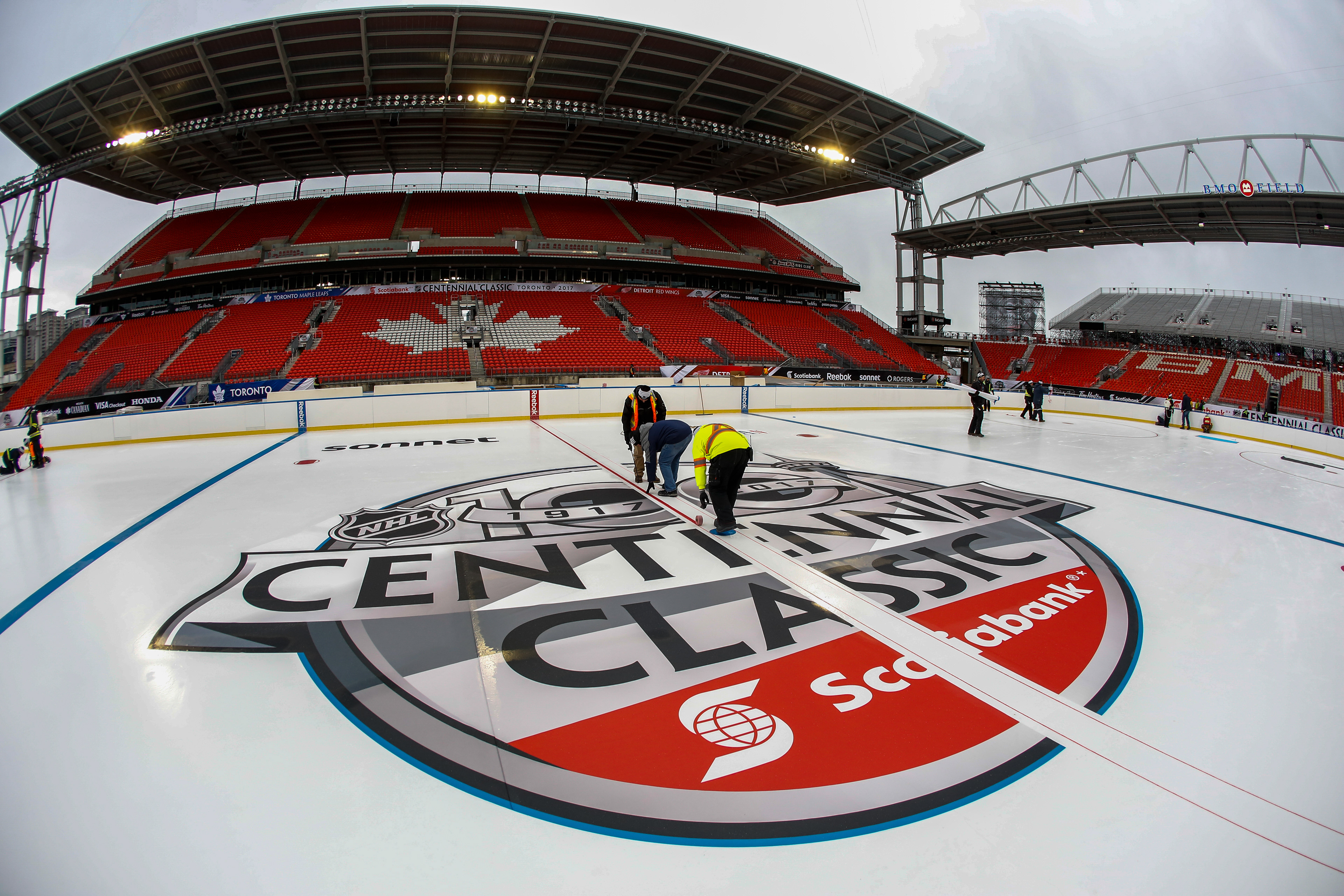


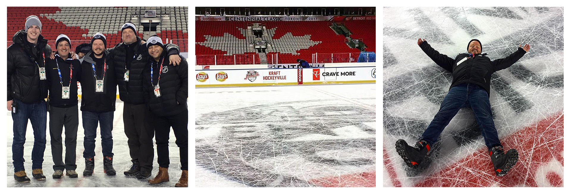
Following the creative development of the identity and look tools kit, our team at the NHL worked closely with Infinite Scale in developing all of the on-field decor for the event. Giving the fans a complete 360 degree experience throughout the weekend events.